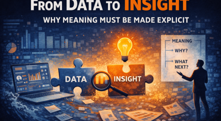
Invisible gaps in most of the dashboard
Think about a typical BI workflow.
- Collect the data
- Clean the data
- Model the data
- Visualize the data
And then we stop. We assume that those insights are now “in there” somewhere, waiting to be absorbed by whoever sees the report.
But insights don’t automatically emerge from bar charts. What actually happens is this:
- People see patterns
- They interpret these patterns differently
- They fill in the gaps with assumptions
- They argue about what it means
And suddenly the conversation shifts from decision making to interpretation.
The data is correct.
The visuals are clear.
But that insight never arrived.
Insight is not information
This is the main difference.
Informational answer: What happened?
Insight answer: Why is that important?
It’s not the same thing.
You can show that churn increased by 2%. You can show that revenue decreased in Q3. You can show that customer acquisition costs are increasing.
None of this is an insight in itself. It’s an observation.
Insight only exists when someone can articulate:
- Why this change is important
- What is implied in it
- What should happen next
Until that happens, you have information, not insight.
Why this is more important than ever
As we’ve discussed in this series, we’re not short of data, we’re drowning in it. We don’t swim anymore!
In high-volume environments, the ability to extract insights becomes more important than the ability to generate visuals.
Because when information increases, ambiguity increases, unless someone deliberately reduces it.
If insights are not made explicit, people will create them. And when different people offer different interpretations, what happens is friction, not forward movement.
Stories are the bridge
This is where storytelling comes into play.
Not telling stories like theater.
Not so much storytelling as spinning.
Storytelling as structure.
A story connects numbers to the real world. It frames what we see, highlights what is important, and explains the implications.
For example:
“Revenue down 3%” is information.
“Revenue fell by 3%, primarily driven by a decline in mid-market renewals following price changes in June, which puts our annual target at risk unless retention improves” that’s insight.
The second version doesn’t dumb things down. It makes the meaning explicit.
This eliminates the need for interpretation for the audience.
It’s not about simplifying the data
There are common objections at this point:
“Surely people should draw their own conclusions?”
Sometimes, yes. But if your role is decision support, your responsibility is clarity.
Being intentional about meaning is not manipulation. That’s discipline.
This means asking:
- What is the essence of this?
- What assumptions need to be eliminated?
- What decisions does this support?
If you don’t answer those questions, the dashboard will become too open. And open interpretation in a business environment often leads to decisions stalling.
In Power BI, structure is more important than visuals
This is the part that most people underestimate. Insight doesn’t come from choosing the “right” type of chart alone.
It comes from:
- structure
- layout
- sorting
- title
- annotation
- narrative flow
A Power BI page with five technically perfect visuals can still fail if it doesn’t guide viewers through a clear story.
- What do we see?
- Why is this important?
- What changed?
- What should we do?
If that flow is not clear, insight will not be achieved.
Costs leave meaning between the lines
When a dashboard leaves meaning behind the lines, three things happen:
- Meetings take longer
- Interpretation fragment
- Decisions slow down
Because the audience is doing analytical work that should have been done before the report was published. That’s not empowerment. That is inefficiency.
The role of analytics is not to present endless options. This is to reduce uncertainty. And reduction requires explicit meaning.
The shift we’re working on inside the Data Accelerator
In the Data Acceleratorone of the core exercises we do is simple:
Take a dashboard and force the team to write, in plain language:
- What are the key insights?
- Why is that important?
- What are the implications?
If the statement is difficult to generate, then the dashboard is not complete.
We didn’t start by changing the visuals.
We start by clarifying its meaning.
Because insight is not something that is extracted by the viewer.
This is something that must be articulated by the analyst.
A simple test
Look at one of your master charts and ask:
If I remove the title and label, could two different stakeholders interpret this differently?
If the answer is yes, then the insight has not been made explicit.
Data is raw material. Visuals are presentations. Insight is interpretation. And interpretation does not happen by chance.
In the next post, we’ll explore how structure, beginning, middle, and end, turns isolated insights into decision-ready stories.
From the series: Dashboards Don’t Drive Decisions (And That’s the Real Problem with Analytics)
Berita Terkini
Berita Terbaru
Daftar Terbaru
News
Jasa Impor China
Berita Terbaru
Flash News
RuangJP
Pemilu
Berita Terkini
Prediksi Bola
Technology
Otomotif
Berita Terbaru
Teknologi
Berita terkini
Berita Pemilu
Berita Teknologi
Hiburan
master Slote
Berita Terkini
Pendidikan
Resep
Jasa Backlink
Slot gacor terpercaya
Anime Batch