FPL Captain’s Choice with Power BI: Story Structured Reports
If you’ve been following my series on data-driven storytelling, especially the last post on structuring reports with a beginning, middle, and end, you’ll know that I’m developing something practical.
So now it’s time to apply that framework to my own FPL report.
Because if the structure works, then it will work if the stakes are clear: picking the right captain each week on your fantasy premier league team.
Turning My FPL Report Into a Story: Beginning, Middle, End
Yours FPL captain’s choice is the most important decision you make every gameweek. This post applies the start–middle–end reporting framework to my Fantasy Premier League Power BI report and shows how to design it to provide clear recommendations.
The structure of a Power BI report should follow the story
In the last post, I argued that a Power BI report should follow the same structure as a story:
Not because it sounds good. Because it reduces cognitive load and improves decision making. So let’s implement it properly. Not in theory. In the Fantasy Premier League.
The beginning: why should I care?
In FPL, there is one decision each week that is more important than any other:
Who is my captain?
Get it right and you double the points of the highest performing player. So you get your best player score twice! If you make the right choice.
If you make a mistake, you could leave thousands of places overnight.
This isn’t just another metric. This is the highest leverage decision in the game. So the first part of the report should frame that explicitly.
No:
- “Match Week Overview”
- “Player Metrics”
But:
Who should I captain this week?
That’s the context. That’s the scope. That’s the decision. Everything below is there to reduce the uncertainty surrounding that one question.
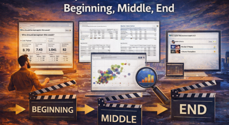
If the report’s opening page doesn’t show that within seconds, then the report isn’t doing its job. As you can see from the screenshot below the report page is named Bstarters – Which player should I captain this week the data suggests based on next week’s point forecast that the captain will be Cole Palmer or Nico Reily with a little Power BI Co-pilot thrown in for fun too.
Middle part: what happened and why?
Once the decision is made, we move to the center.
This is where most of the dashboard is located. However, in the structure of the story, this part has a task: to build trust in the decision.
In FPL terms, that means analyzing:
- high performance players
- high projection points
- strong history maker
- good value player
- comparison by position
But here’s the discipline: We only include what influences captaincy or transfer decisions. Not all.
1) Players with high performance
The shape is one of the clearest short-term signals in FPL. If a player scores good goals in the last 3–5 game weeks, that is significant momentum. So the report should appear clearly:
- Top players based on performance
- With context (position, price, minutes played)
Not buried in tables with rows and rows of data. This should be highlighted. Because form affects the captain’s confidence directly.
2) High projection points (EP_Next)
The projected point is important because becoming a captain is a forward looking decision, you have heard it all before, “Past performance does not imply future results”. Your report should clearly show:
- Top projected points overall
- And top projected points by position
This is where the story narrows. We don’t ask “Who is attractive?” We ask:
Who is most likely to put up points this week?
So our middle section, page one of two is appropriately named Center – Top Players by EP Form and Position looks like this
3) High score but cheap – great ROI for business people out there
Transfers are also important. Don’t forget that. The middle should also appear:
- players with high point totals
- relative to the cost
- with a strong current form
That’s how you identify value.
A £5.5m defender averaging 6 points per game is probably a better transfer than an underperforming midfielder for £7.5m.
The report will help answer:
- If I need a transfer this week, how much is it worth?
- Which positions offer advantages?
This builds the case. This builds self-confidence.

End: what do we do next?
Now comes the part that most dashboards miss. End of story. The implications. Recommendation.
Based on:
- form
- projected points
- mark
- position comparison
The report must address:
This is the captain.
And optionally:
These are the top alternatives by position.
So one of the previous posts in this series did Brent Ozar’s newsletter, called Data Overload Kills Decision Making and he added a comment in his newsletter about my post saying “Gethyn Ellis says Data overload kills decision making, and I would add this is one of the reasons people are leaning more on AI to filter things” So I did, for my end, I got Power BI Copilot explaining based on my data the best team of the week. Here it is if you want it for Friday’s deadline

This doesn’t take away from the nuances. This removes any ambiguity. This provides clarity to managers.
Why it works
This structure works because it aligns with how the brain processes decisions.
Beginning: Why should I care? → Captain’s decision.
Middle: What happened and why? → Shape, projection, value.
End: What do we do next? → Captain selection + alternative.
That’s not creative writing. This is cognitive alignment.
What this means for business analysis
Now zoom out. Replace:
“Who should I captain?”
With:
- Which suppliers should we renegotiate with?
- Which products should we prioritize?
- In which areas should we invest?
The structure is identical. Most business dashboards stop somewhere in the middle. The FPL example makes this clear because the stakes are visible and immediate. If I publish an FPL dashboard that never tells me who should be captain, it’s useless. The same should apply in business.
The real test
If someone opens your Power BI report and asks:
“So what should we do?”
So your story isn’t finished yet. In FPL, that will hurt your ranking.
In business, this comes at the expense of clarity, speed, and alignment. That’s why structure is important.
Want to implement this outside of FPL?
Fantasy Premier League makes the stakes clear.
If the captain is wrong, your ranking will go down. If you make the wrong decisions in business, you will lose time, money and momentum. The structure is the same.
In the Data Acceleratorwe work with teams to move from reporting to decision support — starting with decisions, building reports with purpose, and making the implications explicit.
If you’re serious about turning Power BI reports into decision-making tools, not just dashboards, that’s what we focus on.
In the next post, we’ll look at something even more unpleasant: You’re not the hero of this report, the audience is.
Related: Power BI Report Structure: Beginning, Middle, End
Example: Decision-Based Analysis in Practice: Fantasy Football Examples
Berita Terkini
Berita Terbaru
Daftar Terbaru
News
Jasa Impor China
Berita Terbaru
Flash News
RuangJP
Pemilu
Berita Terkini
Prediksi Bola
Technology
Otomotif
Berita Terbaru
Teknologi
Berita terkini
Berita Pemilu
Berita Teknologi
Hiburan
master Slote
Berita Terkini
Pendidikan
Resep
Jasa Backlink
Slot gacor terpercaya
Anime Batch